Color Palettes That Never Fail Me (And How I Choose Them)
- Marc Garrison
- Feb 27
- 3 min read

Updated: Mar 19
People ask me all the time how I choose colors. And I get why. Color is the first thing you feel when you look at my work. Before anyone notices linework or texture or composition, they notice the palette.
Here’s the honest answer: I don’t start with a big plan. I start with color, and I let the piece show me what it wants to be after that. My process is pretty straightforward. I squeeze fluid acrylic paint straight onto paper in rows, then roll it out in different directions. The blends, edges, and unexpected transitions create the first composition. After that, I’ll bring in ink, linework, or a little collage depending on what the piece needs. But if the color isn’t working, none of the rest matters. The palette has to hold everything together.
I rely a lot on complementary colors, the opposites on the color wheel. They naturally create tension and movement, the good kind. When I’m rolling paint across paper, that tension keeps the work alive. It gives the piece a pulse, even before I start refining anything.

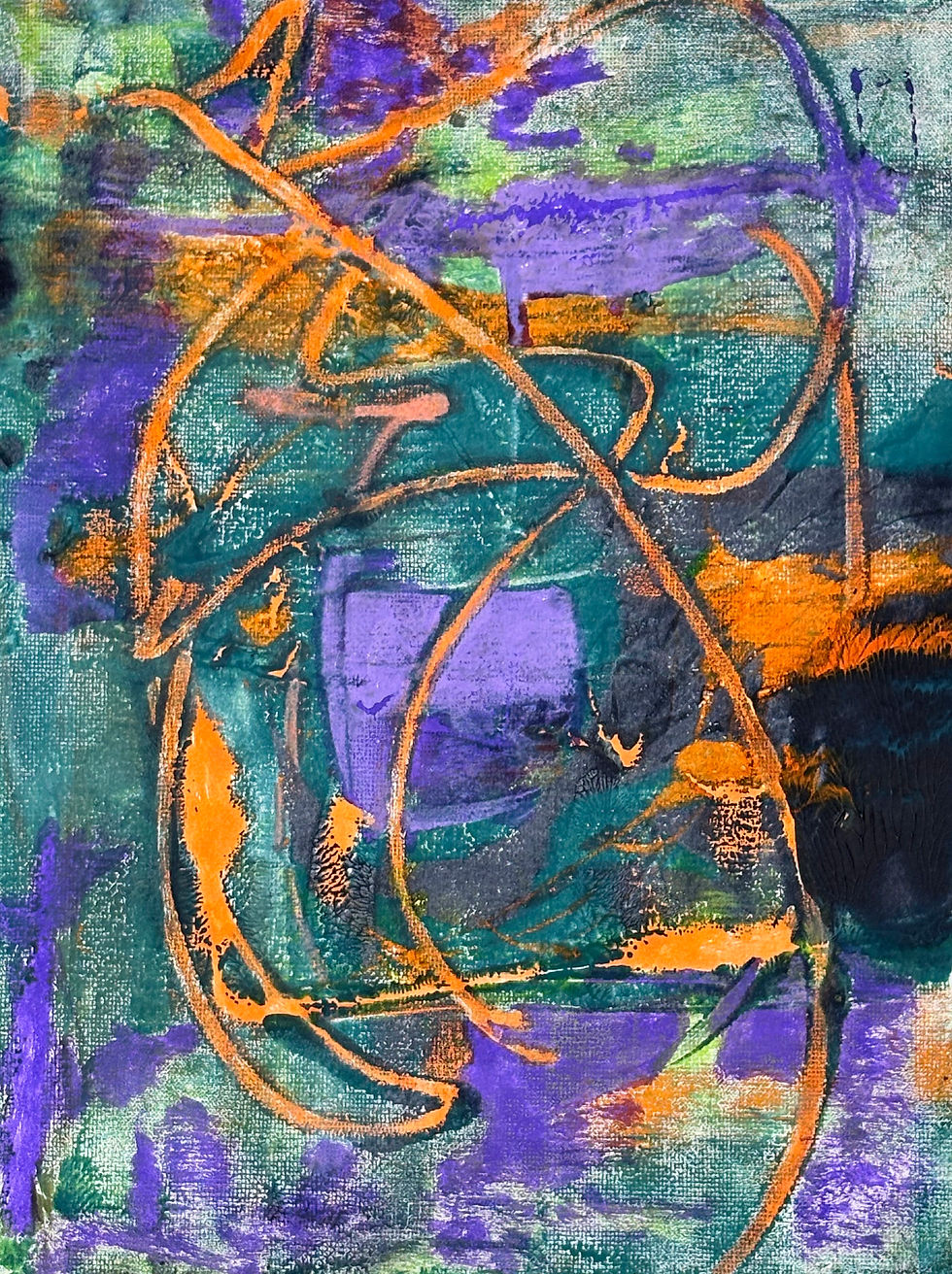
If I had to pick the most reliable color combo in my studio, it would be blue and orange. I come back to it constantly because it just works. Blue gives me depth and structure, and orange brings in heat and energy. When they sit next to each other, they make each other stronger. This palette is one of my favorites when I want the piece to feel bold but still balanced, like there’s a lot happening but it isn’t chaotic.
Red and green is another one I love, but it’s definitely higher risk. If you use the wrong shades, it can look like a holiday decoration. The trick is to avoid the obvious versions of those colors. If the red is intense, I’ll make the green darker or more muted. If the green is bright, I’ll knock the red down. When it’s done right, that palette has a lot of motion and confidence. It’s great when I want the work to feel energetic and full of life.

Yellow and purple is one of the more surprising combinations I use. It can feel playful, but it can also feel dramatic, depending on how it’s handled. Yellow brings light and openness. Purple brings weight. The contrast is strong, and it has a little edge to it, which I like. This palette works especially well when I’m planning to add linework later, because the lines can either calm everything down or push the energy even further.
Sometimes I’ll use a three-color palette, usually some version of blue, yellow, and red, but I never treat them equally. If I give all three the same amount of attention, the piece gets busy fast. Instead, I want one color to lead, one to support, and one to show up in small punches. That simple choice keeps the palette feeling intentional instead of noisy.
Even though I’m intuitive, I do have a few rules I follow so I don’t end up with a muddy mess. I try to start with two main colors instead of five. Two colors are enough to create contrast and movement, and I can always add another later if the piece needs it. I also like having an anchor color, something that holds everything down. It’s usually a cooler or darker color like blue or black or deep green. Once the anchor is there, I can take more risks on top of it.

I also treat bright accents like punctuation. I love a pop of yellow or a sharp hit of orange, but I don’t want them everywhere. A few well-placed accents give the eye somewhere to jump, and they keep the Spiral of Spring — Original Orange & Teal Abstract Paintingpiece feeling alive. Too many, and it turns into noise.
If the color starts looking dull or muddy while I’m working, that’s usually my sign to stop. Rolling paint is fast, and it’s easy to overdo it. Sometimes the best move is to let it dry and come back later with ink or linework to pull the piece back into focus.
The truth is, the palette is only half the job. The other half is composition. A palette can be beautiful, but if the composition doesn’t feel cohesive, I won’t keep it. I throw plenty away for that exact reason. When a piece is working, it has movement and energy, but it still feels resolved, like everything landed where it should. That’s the moment I stop.
If you want to see these palettes in action, I keep my shop small and update it as new work is ready. And if you want first access to new pieces, you can join my email list. I’ll send occasional updates when new work drops. No spam. Just art.


Comments